Founders
The Curators of the Character Set
Sam Berlow and Stephen Coles aren't just cataloging typography; they are documenting the visual DNA of our built environment.
Numerous Times Founders Desk
The first ten years, in the founder's voice
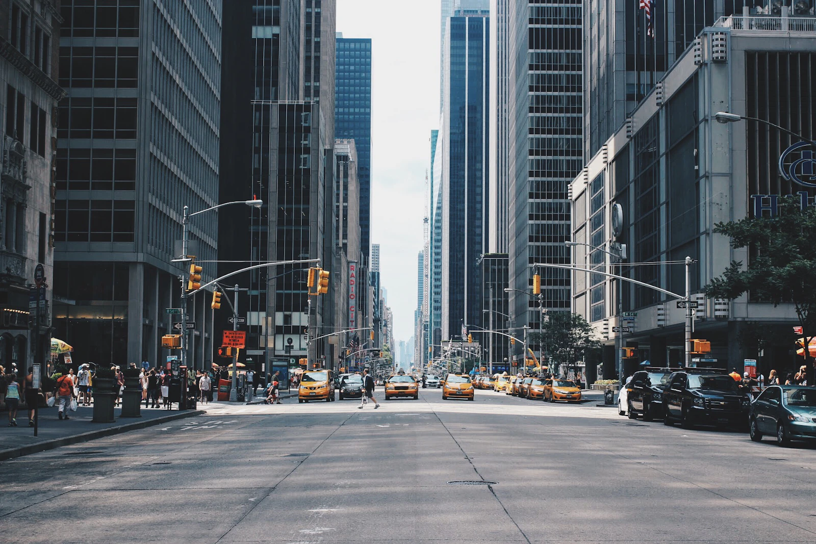
In the basement of every great company is a brand guidelines document, usually a PDF that dictates which serif or sans-serif face will represent the firm's soul. Most people see letters as mere vessels for information. But for the small team behind Fonts In Use, letters are the artifacts of human decision-making. Founders Sam Berlow and Stephen Coles, along with Florian Hardwig, have built something that functions less like a software manual and more like a laboratory for visual sociology.
To look at their work is to understand that no logo or paperback cover exists in a vacuum. A font choice is a snapshot of an era’s optimism or its anxiety. When we talk about the builders of the modern web, we often focus on the engineers who piped the data or the architects of the cloud. We rarely stop to consider the individuals meticulously tagging the heavy slabs of a 1970s brutalist poster or identifying the typeface on a contemporary craft beer can. The team behind this project has spent years providing a taxonomic record of these choices, ensuring that the labor of the type designer is never anonymous.
They operate with a specific kind of discipline. There is no algorithm that can perfectly parse the nuance of an ink-trap or the particular tilt of an italic ‘e’ across different print mediums. It requires a human eye—one trained through decades of observation—to distinguish between a classic revivification and a digital approximation. By creating a searchable archive of typography in the wild, the founders have moved the conversation away from the abstract beauty of a font file and toward the messy, brilliant reality of how those letters actually function on a street corner or a digital dashboard.
This isn't a project built for hype or rapid scaling. It is a slow, methodical construction of a shared memory. When an operator at a design firm looks up a specific specimen, they aren't just finding a name; they are seeing the ghost of the designer who chose it forty years ago. Berlow and Coles have turned a technical niche into a vibrant record of human intent. They remind us that behind every pixel on our screens and every sign in our subways, there was a person—likely tired, probably caffeinated—trying to make a word feel like a feeling. In documenting the use of these fonts, they are effectively documenting us.
One essay. Every Friday. From operators who actually run things.
Join thousands of founders, partners, and operating leaders. No filler. Unsubscribe anytime.
Reader notes
0 NotesSign in to comment. Comments are signed and public.
Sign in →